Improving usability

In the last few days I’ve decided to do a little bit of extra work on our first year project :”Filtrate”. This was due to me wanting to show something off at Open Day.

For this who don’t know, this is FIltrate:

2013-08-22 10_12_46

Rather, that is a screenshot from the current version.

Main game

Some of the things I updated on it were as follows:

  • Adjusted player movement. This was because the player jerked to left or right when pressing the arrow key. In theory, this was a good move to begin with because it meant the player moves in that direction instantly, but as we added better physics to the game it started to not work well. The reason for this is that when you hit an arrow key, it set the player speed in that direction instead of increasing the speed. This meant that you couldn’t do precision landings and also it caused the player to move unnatural when he moves in one direction and then changes direction.
  • Added a circle around the player that reveals what’s behind the player in other dimensions. This was extremely difficult and the end result was really good.The first attempt, I tried to use a white oval behind the player that was used as alpha on the background. This didn’t work mainly because I couldn’t figure out how to set up the blending very well and I moved onto another method.The second method I used was a single large image that was completely white but had hole in the center. This was then placed over the player and the blending functions were applied for the filters using this rather than a white square which is what it was before. This worked well and is how it’s used now. I then made the square change size randomly to make it seem like it was flickering, creating the effect that it’s stuff from another dimension.
  • Added a smokey effect in the dimension circle around player. This also turned out really good. The way I did it was also extremely hard. I’ve explained it all below.
  • Added more levels. This was a result of improving the level editor and just making levels as I tested it. Some weren’t saved, which is sad. But there are some easier levels at the start that introduces the player to the basics slower.

Smokey dimension effect

This is the effect in the game that allows you to see smokey effects on objects in other dimensions directly behind the player.

First, I calculate the red, green and blue filter colours. THese are eased based on what filter has been selected with a formula  c += (0 – c) / delay for colours not selected, and c += (255 – c) / delay for the current filter colour. This wasy the colours that are off blend down to 0 over time and the colour that’s active will blend up rto 255 over time. These are not actually applied to the filter, yet but are needed in the next step.

I then negate these colour values as the blending needs the opposite colour to “show” the actual filtered objects behind it (so to see red the blend needs to be 0, 255, 255, which is all colours BUT red).

I then set up the first spritebatch (XNA for the win) which uses an additive blend state. This is used to render the “Below” level (Everything that is filtered, eg. Not the player and start/end doors or HUD etc.) This draws in 2 modes: 1 draws ONLY the FILTERED dimensions that are NOT active. So if I have red filter activated, this will draw only the green and blue dimensions, but not the white dimension. The reason for this is explained later.

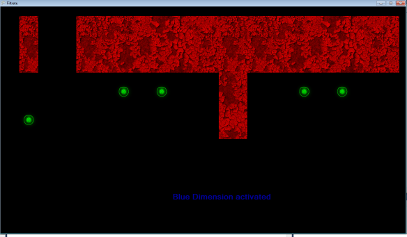
2013-08-22 10_59_20

The next step is to draw the smoke. The smoke effect is a tiled square of smoke (actually an inverted black and white water texture)
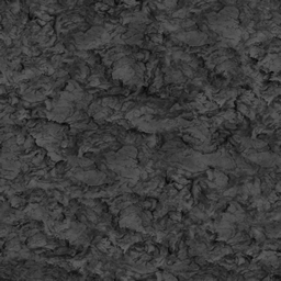
SwirlThis is applied using a “multiply” effect (darker areas are drawn more, lighter areas are more transparent). This causes the effect of dark smokey patches over the top of the underlying dimensions. I then made the UVs rotate upwards and positioned it relative to the camera.

2013-08-22 11_01_16The NEXT step was to render the rest of the level. The easiest part is to draw the neutral dimension. The other dimension (the blue one in this case) needs to be drawn at a percentage of how far along the transition is. Otherwise if we draw the dimensions “if others are off” they will switch instantly and we lose the fade effect on elements on the previous dimension.

2013-08-22 11_02_15As you can see from the screenshot, it is starting to make sense why I’ve done it this way. The neutral dimension doesn’t need to be drawn to have clouds applied because it’s ALWAYS on. Even though technically it’s still counted as being in that all coloured dimensions.

Next, we apply the “filter”, the main aspect of the game. This originally was a stretched plain white 255,255,255 texture, but as mentioned above, it’s been changed to a white square with a tiny hole in the center that reveals our other dimensions with smoke on them (and as you can see, the neutral dimension shines through).

2013-08-22 11_03_07Notice the green orb is smokey because it’s not part of the blue dimension but the player is standing over it.

Then, I apply a dark border just to add a gloomy atmosphere.
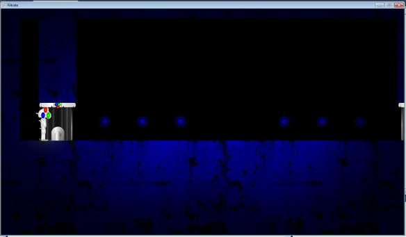
2013-08-22 11_04_39Then we draw the white objects (this has since been changed so it’s drawn under the gloomy border):
2013-08-22 11_05_49And finally the static effects, and the HUD:

2013-08-22 11_07_03Notice that the noise adds a negative effect to the level, which is nice.

Level editor

  • Added dynamic title bar – This is so you can see what level you have open, (or Untitled of none) and a * if you have unsaved changes,
  • Made save feature on close – Added an inturrupt on any close events that causes a “Save changes?” dialogue box to appear.
  • Multiple select items with shift – This was very difficult as object with change properties would change every object’s properties to the last selected item, so I had to add a check on every variable if it’s the same as it was and if not, it edits JUST that property. Worked well in the end.
  • Can create platforms dragging up and left now – previously, platforms could only be created by dragging from a point down and right. To fix this I did a check for if the final mouse positon’s x or y was lower than the starting mouse pointer’s x or y and if so, reversed the formula.
  • X Y Width Height in properties now NumericUpDown – Before this was a textbox which not only needed converting, but had to be edited to see changes. Now you can just click up or down on the arrowds on eahc box.
  • Made texture in properties a dropdown with default “” – I plan on implementing this properly for the sake of variation in levels. Levels will have customisable textures for help signs etc.
  • Removed corkscrew button / removed goose button – These weren’t implemented
  • Added zoom function – Can zoom in and out by multiples of 8
  • Added shortcuts for menu items Ztrl+O opens etc.
  • Got Exit to work / Got New to work – they obviously didn’t work. Exit also promps for save.
  • Added caution box for unsaved data – as mentioned above this was implemented by the close inturrupt. This was done with a simple variable that was set to ‘true” when something was deleted or added to the scene. And set to false when the level is actually saved. This state is used to add the * in the title bar.
  • Added check for locked files – If the level editor tries to save a file that is locked, it would crash. To stop this I added a function that used try / catch on the file stream.
  • Clicking nothing de-selects everything – I kept doing this to de-select items so I just implemented it by making use of the function “DeselectEverything” that had already been implemented.
  • Made 2 levels of grid lines – most of the levels I had made used 2 by 2 sections are they just looked nicer. I added a darker grid line for every second one to help with this sort of level style.
  • Made dimension and effect button selections more obvious – Before it was hard to see in the properties panel which button was pressed as they had little background or shading. Now they use bright colours.

2013-08-22 11_41_45

Camera bugs and research

Camera bug

I found a bug in my camera programming. The issue was that when the ray flying towards the camera HITS the transparent-able wall, it doesn’t go any further, which means if the camera is behind a solid wall, it never hits that, therefore the camera can go through walls if its behind a transparent wall.

To fix this, I put the transparent wall objects on the transparent effects layer and used that for things that are “not solid”. These include also the mother and children.

I then changed the programming to fire 2 rays instead: 1 to check with transparent things, and another to check with solid walls. This worked, however, I realized that it wouldn’t if there there was perhaps 2 transparent effects. This means I will need to do a loop of rays, each time ignoring the previous object, until the ray hits the camera. This will be quite difficult, and I may have to use some other method than a ray, or tweak the ray more so it can ignore certain objects or something. I did some research but couldn’t find much help.

Research

Other than trying to fix the camera, I also did more research for cameras. Looking into it at the beginning of the project, the camera seemed pretty straightforward, but as the project comes along it’s starting to seem more complex.

I had a look at some videos of games that used cameras such as Mario 64, Banjo Kazooee, Journey, and various other Mario games. One thing I notices, especially with Mario 64, was that the camera had an AI. It seemed that at certain times in the game, the camera would position its self and aim in certain directions depending on what was happening. For example, when Mario has to fight Bowser, the camera zooms into Bowser’s face from behind Mario, and when game-play starts, the camera “LERP”s back to its normal position (orbiting Mario from a set distance). The camera controls and type of view are signified by an icon at the bottom-right of the screen. There’s also wall avoidance that was included.

As well as this, I did some reading for the camera in Unitie’s 3d person tutorial. The only thing I found to do with the camera in particular was that the camera has a “near” and “far” camera, that are both combined to make the finished image. This seemed like a good idea, but for the time being we will just render everything to the current camera until any tests reveal slow-downs of the game.

After all this I can see that the camera is going to be a quite large task. It is also a main element of the game. I think for a good camera, it will need a lot of sections in every level that tell the camera to navigate to a certain angle if the player is standing in certain area, mixed with any key things in the level that need to be in view. I can combine these to try and get a nicer camera.

Twitter API 1.1 in cakephp 1.3

ALthough at the time of writing this, vendors have been deprecated in cakephp, I’m going to write this article because I want to start doing more useful tutorials instead of just school work.

This tutorial will only work for cakephp version 1.3.

Today I did some work. This work was basically “Help my twitter feed has been broken for months”. Never fear, Jimmy is here. To save the day.

This problem happened because Twitter decided to remove old functionality with their Twitter feeds like RSS and atom feeds. This is good because “Bring on the future!” but also bad because a lot of javascript libraries used these old methods and now they are broken. Like the one I was using on this website.

To fix the issue I had to comb the interwebsites to finds me some tutorialses. One in particular was pretty useful and showed how to grab the twitter feed, which is all I needed to do. The process is as follows:

  1. Log into https://dev.twitter.com/apps/
  2. Create a new app
  3. Create an access token
  4. Leave this page open so you can copy about 4 damn codes along to your program
  5. Search for the twitteroauth code on github and download it.
  6. In the zip, grab the twitteroauth folder with twitteroauth.php and oauth.php
  7. Paste this folder in cakephp’s app/vendors folder

MEANWHILE, on your web server (or localhost), you’re editing a cakephp CONTROLLER file. In this case, because the twitter feed was on every page, I was editing the app_controller.php.

In your controller, you need the following:

// Load latest Twitter data from cache
$tweets = $this->Session->read('Twitter.latest');
if(empty($tweets)) 
{
	// Path to twitteroauth library
	App::import('vendor', 'twitteroauth/twitteroauth');

	// vars for use later
	$twitteruser = 'username';
	$notweets = 3;
	$consumerkey = 'xvsdfsdfsd';
	$consumersecret = 'sdfsadfsadf';
	$accesstoken = 'sdfsadf';
	$accesstokensecret = 'sdfsdaf';

	// function creates new connection
	function getConnectionWithAccessToken($cons_key, $cons_secret, $oauth_token, $oauth_token_secret) 
	{
		$connection = new TwitterOAuth($cons_key, $cons_secret, $oauth_token, $oauth_token_secret);
		return $connection;
	}

	// get connection using the above function
	$connection = getConnectionWithAccessToken($consumerkey, $consumersecret, $accesstoken, $accesstokensecret);

	// request tweets json
	$tweets = $connection->get('https://api.twitter.com/1.1/statuses/user_timeline.json?screen_name=' . $twitteruser . '&count=' . $notweets);

	// add into session cache
	$this->Session->write('Twitter.latest', $tweets);
}
$this->set('tweets', $tweets);

And there. Look through the code. The comments tell you what it is doing. Basically make sure you paste the codes and usernames into the fields, The data there is example data.

The reason why I’ve added that session stuff is because the twitter call from the website is slow as balls and if I had to wait 5 – 10 seconds on every page load I’d probably shoot myself. This basically stores the tweet data in the session because it’s quicker that way. The user will now only experience an initial slow page load but no slow-down after that.

Then, in your view, you need something like:

$twitter_output = '';
if(!empty($tweets)) 
{ 
	$username = 'twitter_username';
	$html->tag('h4', 'Latest Tweets');
	for($i = 0; $i < 3; $i++)  	
{ 		
$twitter_output .= $html->tag('p', $html->link($username, 'http://twitter.com/' . $username, array('target' => 'blank')) . ': ' . $tweets[$i]->text);
	}
}

The above may or may not need some filtering on that text, for example: links won’t appear as links but just HTML. Twitter converts these on its own.

In new versions of cakephp, it is recommended that you create a plugin or a type of package for this sort of thing rather than vendors. Vendors are lazy and… I don’t know. But if you need a quick fix for a client, then this is your best option.

There you have it, Twitter API 1.1 on cakephp 1.3.

Leave comments if you have any better ways of doing things.

Touching cameras

Friday was my first day of programming something and I have been assigned the camera.Today I was aiming to get the basic camera controls working, which included:

  • Following the player
  • Orbiting the player
  • Being smooth

I managed to get all this done within my time limit, plus add some more functionality which was wall collisions and even a script that fades out smaller objects between the camera and player.

20130805022152
Gantt chart of days to spend on camera

Here’s the technical breakdown:

I started with an invisible transform that the camera was parented to. This transform will not be locked to the player, but be free and then seek out the player on an easing LERP type of movement. I pushed the camera out on it’s Z away from this transform, and kept the rest of he offsets at 0. This worked well because it meant that the Z could act as the “distance” from the player (or the target).

The camera had an issue with gimble lock, when the 2 axis rotates around the player, the camera would lean sideways and go around the wrong X axis. To solve this, I created 2 cubes (that are made invisible when the game starts), 1 is the X axis, and the other is the Y axis. the Y axis one is parented to the X axis one. This way I can use the X axis cube to only rotate around the Y axis to orbit the player, and use the Y axis cube to only rotate up and down (on the X axis).

20130805021254

20130805021259As you can see, the tree structure of the camera system is parented to each other.

20130805021317

This system worked perfectly.

Another thing that I tried to do was to limit the amount of editable variables in the script. I did this by only including things that would make sense to the artists so that they can tweak it for the game. These were the values that controlled the speed up and speed down of the camera when you rotate it.

20130805021343These values were used with Delta time to make the camera smooth and dreamy (not too fast). It took a lot of tweaking to get right.

The next task was to get the camera to not hit walls and floors. After a lot of looking on Google, I couldn’t find much of anything to help with this apart from one article saying that I should cast a ray from the camera to the player and if it hits an object and not the player you know that there’s something in front of the player. This made sense to me and I spent a while implementing it. Once it worked, I realized that it was a stupid method because as soon as the camera goes through a wall and casts a ray, it won’t hit any object because it’s INSIDE IT. I had to re-think this method.

After about 2 minutes of thinking and annoying other programmers, I went and tried another method which was the same ray method except instead of casting a ray from the camera to the player, I cast a ray from the player to the camera, using the direction the camera is pointing but negated. If this ray hits a wall and NOT THE CAMERA, then we know there’s something blocking the player’s beautiful face. I managed to make a system that eases the camera into a “target distance” that is set when the ray hits a wall. So imagine panning the camera up a and you run into a wall. The target distance will change and then the camera will ease towards this target distance. In the end this effect was really nice and the camera was coming along really well.

I then implemented a way to stop the camera from orbiting over the top of the player and back down resulting in a dick-head roller-coaster. I can imagine play testers doing this and laughing their stupid heads off, and that made me shudder. I did this simply by checking the euler angles are not going above or below a certain threshold and if they do, take over the button that they are pressing and perform the opposite reaction which is pull away. This appeared like the camera was slowly bouncing away from the position rather than jerking to a stop like it would have and it looks nice.

Another thing I took into consideration was when the camera is on the floor looking at the player, the user can keep rotating the camera down until it is right up the player’s crotch. We don’t REALLY want this, so I added some code to detect this and force the camera to rotate up. I did think about this and thought that the camera would explode if this happened in the opposite direction, IE, the camera is hitting a roof and gets too close to the player… I’m just going to hope that this doesn’t happen because I don’t know what would happen to the camera, poor thing. If it does, I’ll just detect if it’s above or below the player and then just send it rotating towards the middle.

So now the camera is perfect (lol, not really) we now had another problem: When some bastard chunk of wall or anything decides to get in the way of this ray, the camera jerks in front of it. This is kind of what we want because we want to be able to always see the player, except if say a bit of dust or a blowfly goes in front of the camera, we are going to give someone an epileptic fit.

The solution I came up with was also part of the same article which went something like “IF there’s an object in front of the player and the camera and is a close distance make the opacity of the object 30%”. I thought this was a dumb idea until I saw the camera in action, and then I realized I could use part of this in my camera.

The thing I ended up doing was to create a script called “Seethrough”. When adding this script to an object in the scene, if it gets directly between the player and the camera instead of jerking the camera in front of it, the object between will go half transparent, still showing the player, but also the wall or dust or whatever. The only issue I found with this apart from having to make sure this script is added to every object like this, is that the shader needs to support opacity. The default unity diffuse shader doesn’t. I will have to make it clear to everyone that this is important or things might start going bad. I did think about using tags but because we couldn’t tag things more than 1 tag, It wouldn’t have worked as well.

Here’s the “Seethrough” script in action:

20130805023738 20130805023746

A problematic thing I took into consideration was that if the player was up on top of a flat platform with a gap below it and the camera went down below this gap and it blocked the player, the camera would jerk up to the position just below the player’s feet. This was part of the floor issue when the camera got too close, I’d push the camera so it rotated up. I’m hoping this will not become too much of an issue. It’s an indie game for feck’s sake. I’ve seen worse camera systems in games. But we’ll leave that for when the issue comes. If it does.

Happy programming.

Reality check on puzzles

Today along with my programming of the camera system (Which is coming along amazinly) we had Sam (an art teacher) come and ask us how the game was coming along and to see how the puzzles were going.

The artists began to explain this one puzzle that included the player carrying a boulder, and pulling a rope to get an object down from something. Sam freaked out and said that this was ridiculous because the effort needed in programming and art would be too much for a simple puzzle game. I’m glad Sam did this because it came back to the other day when I told the team how hard these sorts of puzzles are going to be and that we should be keeping them as buttons and switches.

Later on in the day I had a look at some of the puzzles and they are coming along really well. Although they are not finished and I haven’t seen them (I hope to on Wednesday) there was one good one where you had to figure out a path along a set of square platforms and if you get it wrong, a door shuts at the end and you have to activate a button again at the start. This is the type of thing that’s both easy to program and also uses elements like buttons and switches that we can slowly introduce to the player throughout the game.

Serious team work

Hey there. So are you ready for a very serious and long article? Really? You are ready? Oh good. Because it’s very long. And very serious.

The last 2 days were interesting in the Touch team. I spent the first day doing some management and planning things like organizing Asana more, estimating time for each task and making a gantt chart. Because this sort of thing is important for teams to work in a timeline on a project, I find it an essential thing to do. It’s basically what we are being assessed on for this project; planning and completing a project from start to end. This is the most important part.

The documentation process is important but not very exciting. I was shown a gantt chart tool and used that to plan out a rough estimate of times and bars that we could use to make sure things get done on time.

Towards the end of the day we were discussing with the artists in the team the ideas for the puzzles they had. Some of them had inconsistencies in the main back-story of the game that Dexter (our team leader) had written. The puzzles were going to be placed in the centre of a city and you were supposed to figure out the puzzles throughout the city. This to me didn’t make sense as why would there just be random puzzles thrown into the center of a city? The solution Dexter had was that the puzzles would be part of the landscape and you would need to move object and activate switches that pushed buildings and collapse parts of the landscape to remove rubble. I didn’t like this idea because firstly, we discussed puzzles and agreed that they would be made modular with small switches and buttons activating lifts or moving doors / boxes, secondly, Matt (our programming teacher) said that we should be designing the puzzles first and build the artwork around them, not design a bunch of art assets like crumbling buildings and then try and make a puzzle out of that. Thirdly, this would require the artist to design an model complex unique puzzles around the game  that would require a lot of physics and animation which will add time, bugs and will be really hard to make it look right. I tried to talk them out of it but it seemed like absolutely everyone in the team thought it would be okay and that we have plenty of time to do it. The argument was that they could just make each puzzle play an animation when you activate something. This would be okay for things like the bridge puzzle, but there’s just so many variables and things to consider that it makes me uneasy to think of what I would be expected to program when the original puzzles were so hard to program in the first place. Especially since we don’t know what the puzzles will be.

After everyone basically shut me down and then complained that I was wasting time when people could be using that to actually do work, Dexter took me outside and told me that I was wasting time and not doing the work I was supposed to: IE programming and not trying to interfere with the design and artwork. He told me that he had to speak with the teachers about me not putting any effort into the team and also doing the incubator work. Firstly, doing the incubator work didn’t have any affect on the prototype at all apart from a 1 hour period where a meeting with them went late, and with the rest of the “slacking off”, that was just half a day where we had the exam which was unavoidable, and 1 whole day that I took off to finish an assignment that was taking too long to finish. All and all, I completed everything I was assigned to do in the prototype in time for the presentation, and thus our team got through. I can’t see what the problem is.

He also said that the code that I had done in the prototype was not sufficient enough for how long we had for the prototype because I was “messing around” with his designs and doing things I was not supposed to do like adding buttons where they shouldn’t be in the puzzles. He also said that that other people have said I should have been able to write better code in the time that I had. I think this was not fair and that it seems like Dexter just sees me as someone that’s trying to take over the project and wants me to stay out of it and just do the programming that he needs. I told him that I just want the project to be done well and that all these complex puzzles would be hard to do. He seemed to have the mindset that we should just build everything we need to and we will fix problems when they occur. I think this is a retarded way to work, and that he’s doing a really bad job at managing the team. Everyone needs a concrete thing to do and he’s just been assigning artists to do their own assets without a reason to use them. The programmers have been kept out of the whole process and been told to just program what’s needed. But how can we program what’s needed when we don’t even know what the puzzles are or what mechanics are even going to be in the game, as it keeps changing?

Adding the extra platforms to the bridge puzzle during the prototype was to keep the design of the 2 puzzles the same. The issue originated from the gate puzzle where there was no clear way to activate the triangles to the user so I added the platforms that lit up as a way to show that they were being activated at the same time as showing which face on the triangle was the one that was active (Otherwise there was no way to show which one was). This was a design issue with the puzzle its self and this is why in the planning stages of the main project we agreed to have both a programmer and an artist involved with the puzzle design so they both look good artistically and also make sense mechanical and user-friendly-wise. I showed the activate-able platform idea to the artist that designed the gate puzzle and he basically said “Whatever helps make it work man”. I then added them to the bridge puzzle to keep the puzzles similar to the gate one because 1. it was easier programming-wise to re-use already programmed pieces of the level, and 2. if we just used the buttons you’d be introducing the concept of the buttons on the bridge and then a whole new concept of the platforms. Dexter didn’t like this and then told me to remove the platforms and leave the buttons there instead. This was the reason why I took so long with the puzzles; because I had to remake things he didn’t like. The end result was that we used the buttons in the gate puzzle without platforms which worked well although I mostly made the choice to do it this way based on Dexter’s disagreements because the other artist didn’t care how his gate puzzle worked, as long as it was working at the end, and it was, and now everyone was happy.

All and all, I think I need to stop being so pessimistic about all the ideas the artists come up with but at the same time try and stop major problems,otherwise the team will just end up hating me.